

Read this before starting a mini design movement.
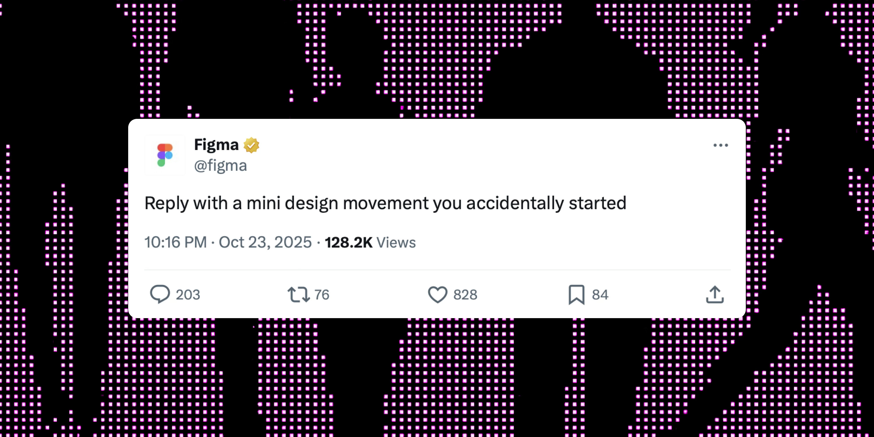
Earlier this week, a designer on X claimed he had “accidentally started a mini design movement.” Within hours, it became a meme. Even Figma joined in. Why did this blow up, and what can we learn?

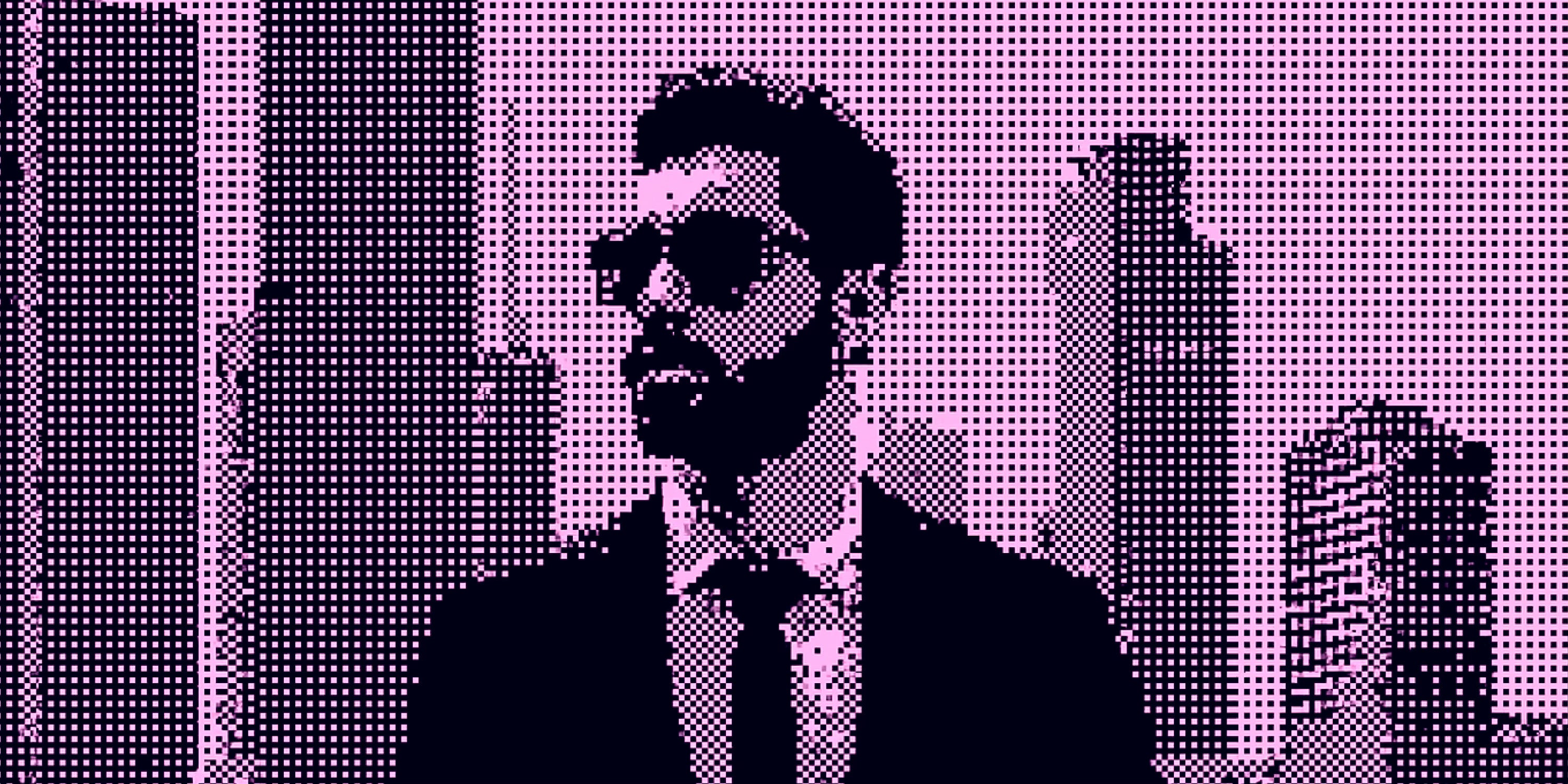
It all started with a post on X, in which the author was referring to the dither effect, that soft grainy texture suddenly appearing on every SaaS landing page. Within hours, it became a meme. Designers joked about their own “movements.” Even Figma’s CEO joined in.
Funny, but also revealing. It says a lot about where design culture in tech is right now: fast, self-referential, and often disconnected from its own history.
The post itself wasn’t that interesting. The reaction was. Some designers were genuinely outraged that someone could take credit for a decades-old visual technique. Others joined in ironically, joking that they had “invented” gradients, glows, or drop shadows. Even some major design tools got involved, fueling the discussion. It created a mix of parody, debate, and reflection: a perfect snapshot of how design culture works online: part discourse, part performance.
Product design today moves insanely fast. Many designers come from non-traditional paths such as bootcamps, coding backgrounds, or self-taught routes. They’re quick, sharp, and execution driven. But that speed comes with a cost. When something like dithering appears, it feels fresh. In reality, it’s one of the oldest tricks in the book.
Dithering wasn’t invented for style. It was born from constraint.
In early print and computing, machines could only show a handful of colors or shades. To fake gradients, designers arranged tiny dots or pixels to trick the eye into seeing smooth transitions. Up close, it looked like noise. From a distance, it looked like tone.
This technique, known as halftoning in print and dithering in digital imaging, dates back to the early twentieth century. It powered newspapers, arcade games, and early Macs. The famous Floyd Steinberg algorithm from 1976 spread color error between pixels to make images look smoother on low-bit displays.
What started as a technical workaround became an aesthetic. Designers began to use it intentionally to give digital work a tactile, imperfect feel. It’s nostalgia for friction. A way to bring texture back into a world that’s too polished.
This cycle isn’t new. We’ve seen it before with duotones, embossing, glows, and noisy gradients. Each time, the effect spreads like wildfire across socials, design templates, and startup websites. The more accessible design tools become, the faster these waves move. The problem isn’t speed. It’s context.
When everyone references the same few tech brands, taste collapses. We end up with the same palettes, the same grids, the same grain overlays. Texture becomes a brand signal built on trend, not meaning. Style replaces intent.
If you know where visual ideas come from, you can use them with meaning. Dithering wasn’t about aesthetic choice. It was about limitation. Understanding that changes how you apply it.
Almost every visual trend you see today started as a practical solution somewhere in the past. Trends will always come back around. That’s fine. The real question is whether you use them as tools or shortcuts to taste.
So if you’re going to start your own movement, at least know what you’re copying.
Keep dithering,
— Fons
Dive deeper into the world of dithering: