
Why we created a custom typeface for Offgrid
The story behind Offgrid Sans, our custom studio typeface — and why every designer should consider making one.

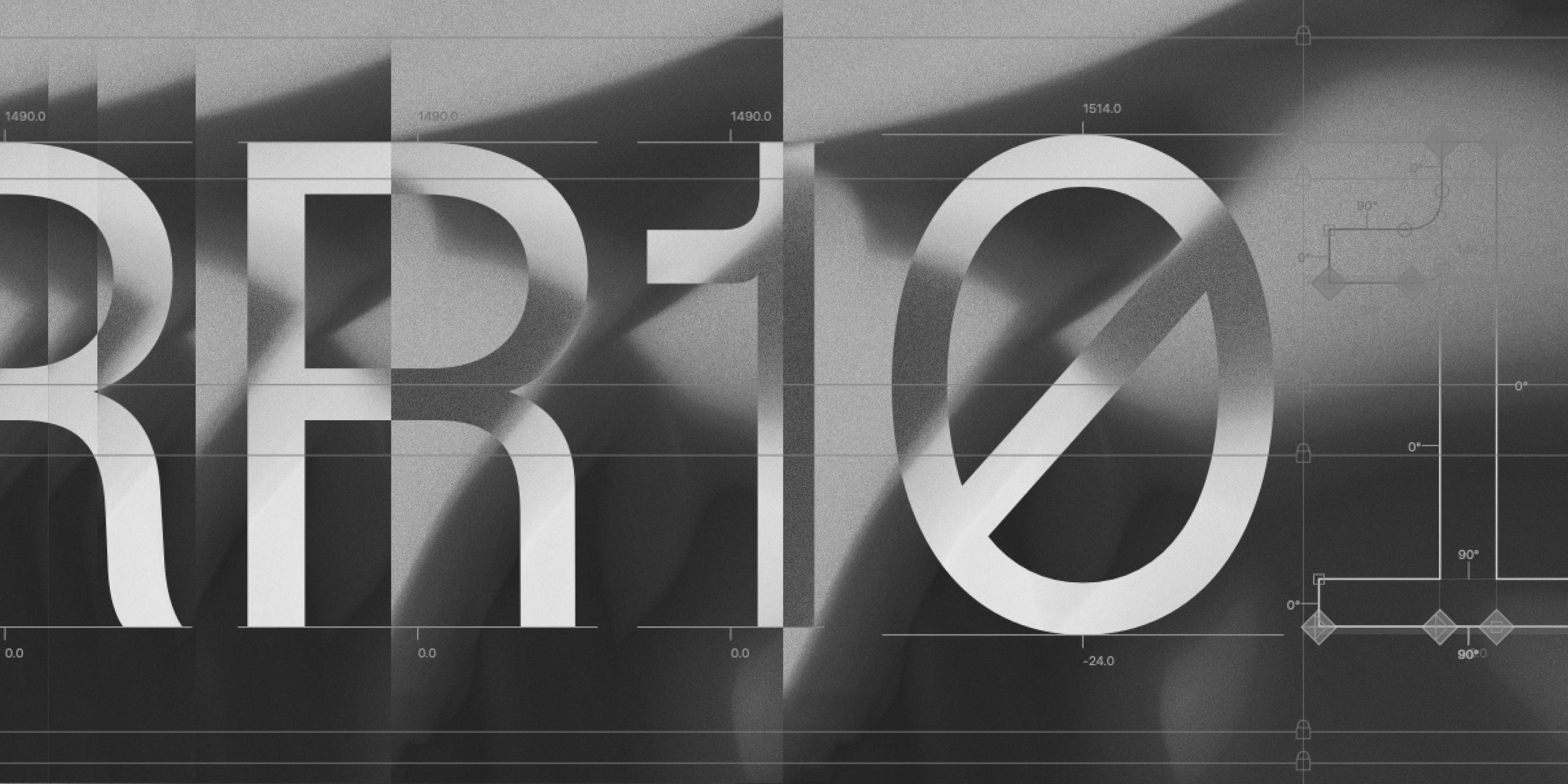
In the past few months, I’ve been working on something different: a custom typeface for my design studio, Offgrid. It’s called Offgrid Sans, and today I’m sharing the story behind it — why we made it, what I learned in the process, and a free download of the full type family for paid subscribers.
Why we made it
When I started building the Offgrid brand, I wanted the logo to be as simple as possible. Just the wordmark. But if your logo is that minimal, every detail matters.
Typography carries enormous weight in branding. It shapes how a company feels before you even read a word. So instead of picking a font from a marketplace, I decided to create a custom one — something that would reflect the studio’s design philosophy: precise, minimal, opinionated.
I teamed up with type designer Nicolás Massi, and together we created Offgrid Sans. We started from Inter by Rasmus Andersson, a beautifully open-source foundation that’s already optimized for digital use. From there, we made targeted changes:
